JAVA: A VENUE BOOKING PLATFORM
-
PROJECT TYPE
Designlab: UX Academy Capstone Project
-
TIMELINE
7 Months (ongoing project)
-
TOOLS
Figma, FigJam, Adobe Illustrator
-
DELIVERABLES
Responsive desktop, tablet, & mobile website
THE PROCESS
-
1. IDENTIFY
• Identify the problem
• Develop hypothesis
• Build scope/timeline of project
-
2. RESEARCH
• Competitive Analysis
• User Interviews
• Debrief findings
-
3. IDEATE
• Personas
• Storyboards
• Card Sorting
-
4. PROTOTYPE
• Sitemaps
• User & Task Flows
• Low-Fidelity Wireframes
-
5. DESIGN
• Branding
• Mid & High-Fidelity Wireframes
-
6. ITERATION & LAUNCH
• User Testing
• Refine end product
• Dev Hand-Off
STEP 1: IDENTIFY
HYPOTHESIS
I think it would be extremely convenient for users to be able to access resources all in one place, rather than search online and through social media to find consistently positive recommendations for venues. This would allow the user to cut out the middleman in terms of referrals, and allow them to go straight to the source, book, pay, and review.
(Think Zillow meets Airbnb, meets Eventbrite)
STEP 2: RESEARCH
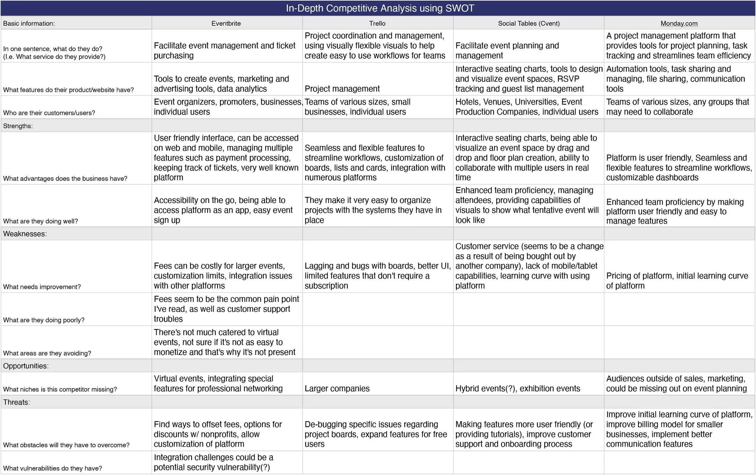
COMPETITIVE ANALYSIS
I conducted a competitive analysis to compare and contrast basic features, pros and cons, target audience, and various similarities and differences between platforms.
Why is this important? It provides insight into what has consistently worked for users to reference, and opportunity by exposing areas that can be improved on.
Examples:
• Highlights: each platform listed, consistently did well with enhancing team proficiency with easy-to-use features.
• Blind spots: a steeper learning curve of the platform can hinder ease-of-use for users who are new to event planning, or simply want to casually plan events without a team.
USER INTERVIEWS
My interviews consisted of 4 guests, each with different levels of experience in event planning (specifically networking events). I wanted to learn about the in’s and out’s of organizing events of various sizes, and some of the basic needs and pain points that an event planner experiences during said timeline of facilitating an event.
RESEARCH DEBRIEF
After researching and interviewing prospective users, I learned that they would find a lot of their pain points to be centered primarily around the physical logistics, such as finding venues, vendors, and hiring companies for video/sound. I learned that each of these are important in creating the ideal experience for an event, but there are also factors that should also be accounted for. I highlighted the themes that were consistently brought up the most during each interview, which included:
• Choosing venues
• Customer service/experience
• Marketing
• Event management software & use of AI
HOW MIGHT WE?
How might we explore ways to help users gain better access to finding the right venues for their events?
STEP 3: IDEATE
PERSONAS
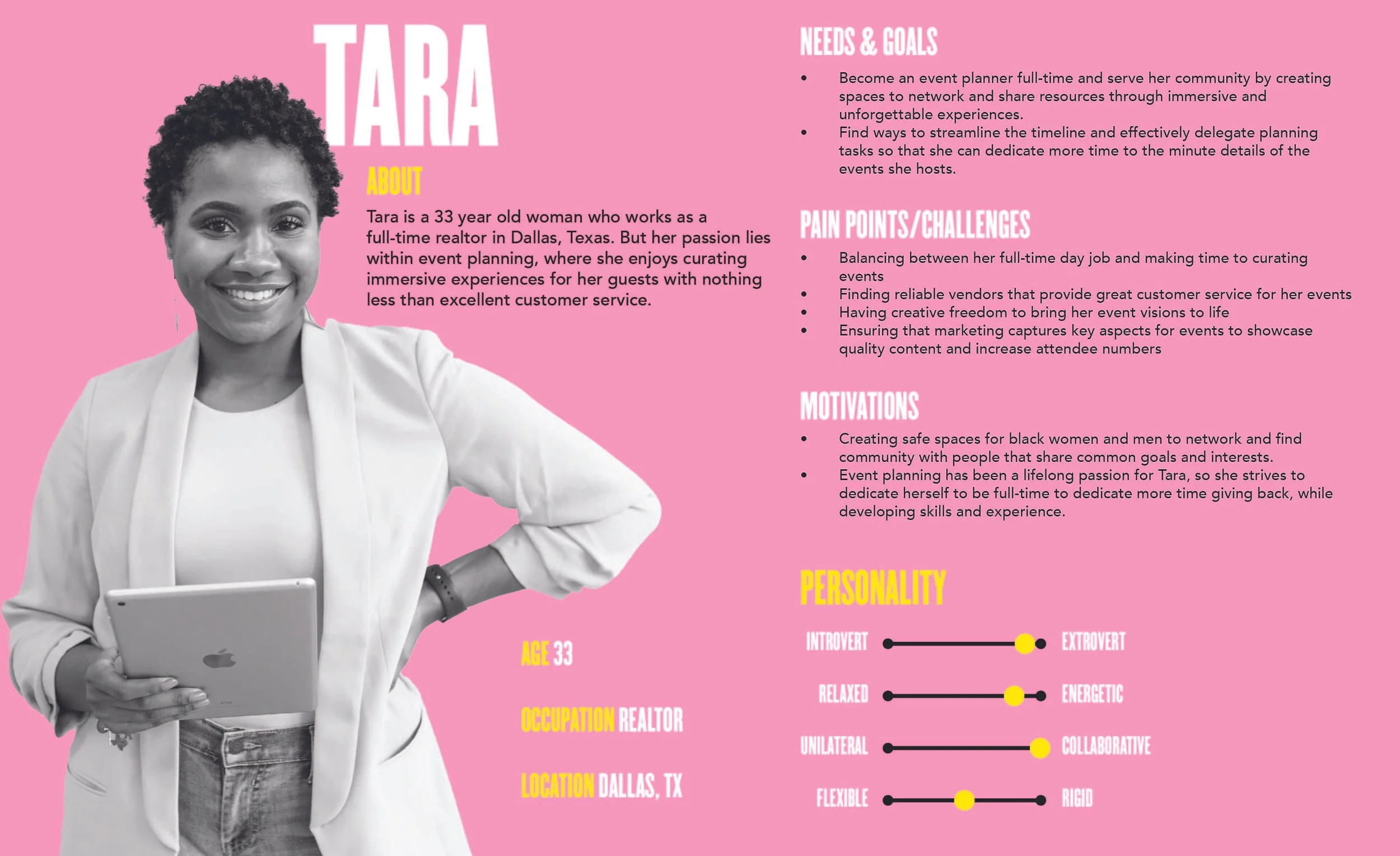
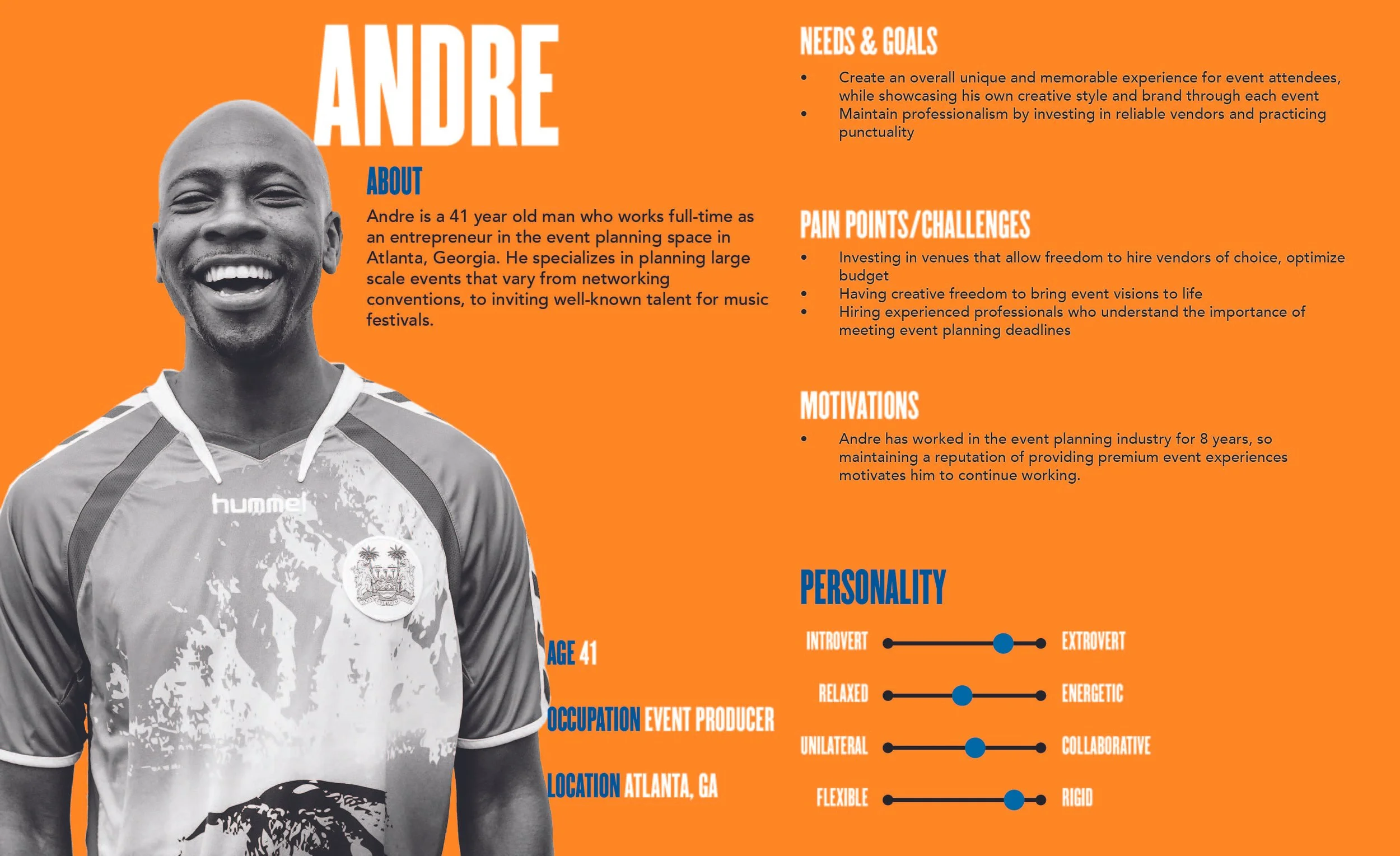
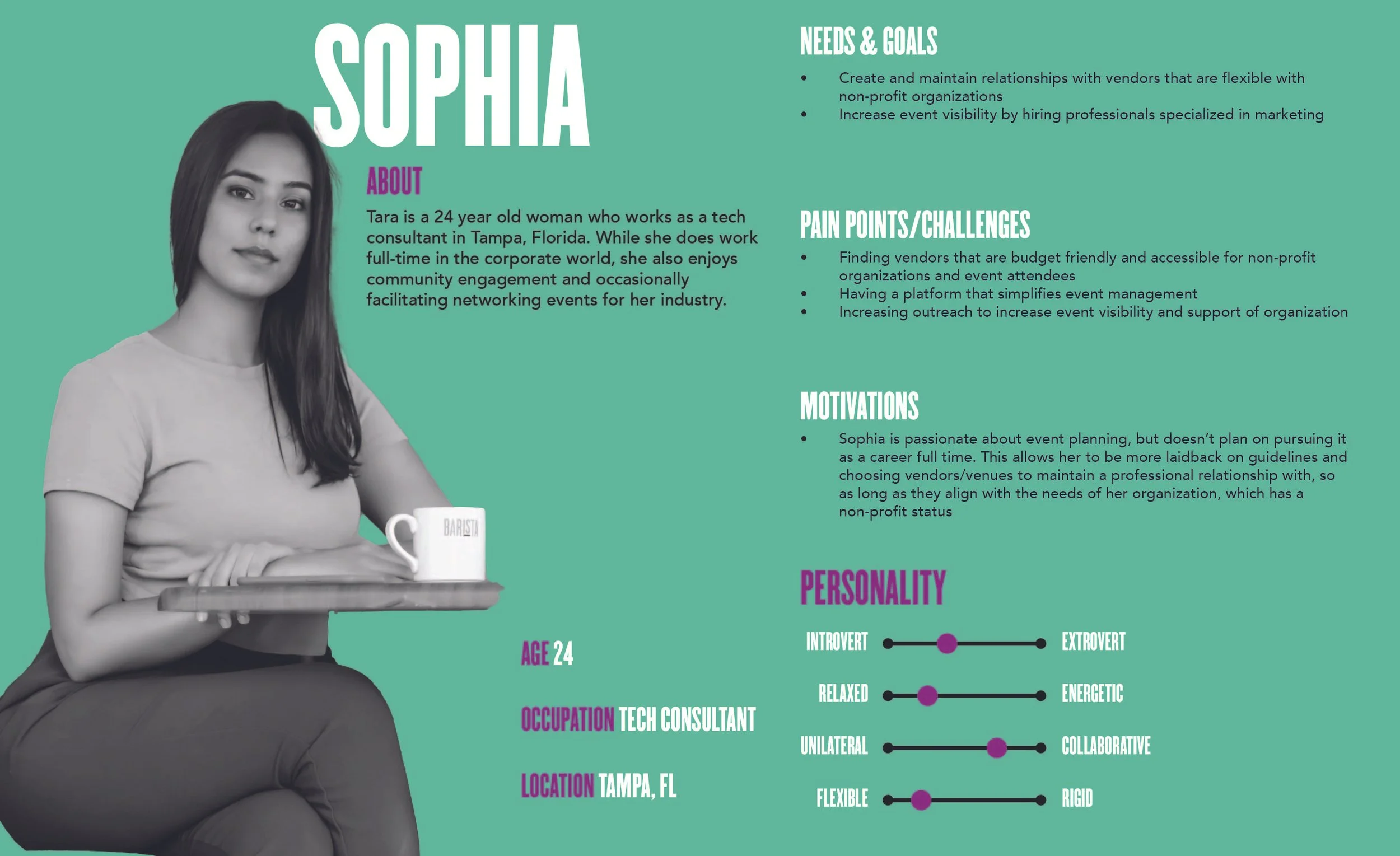
aaaaaa
STEP 4: PROTOTYPE
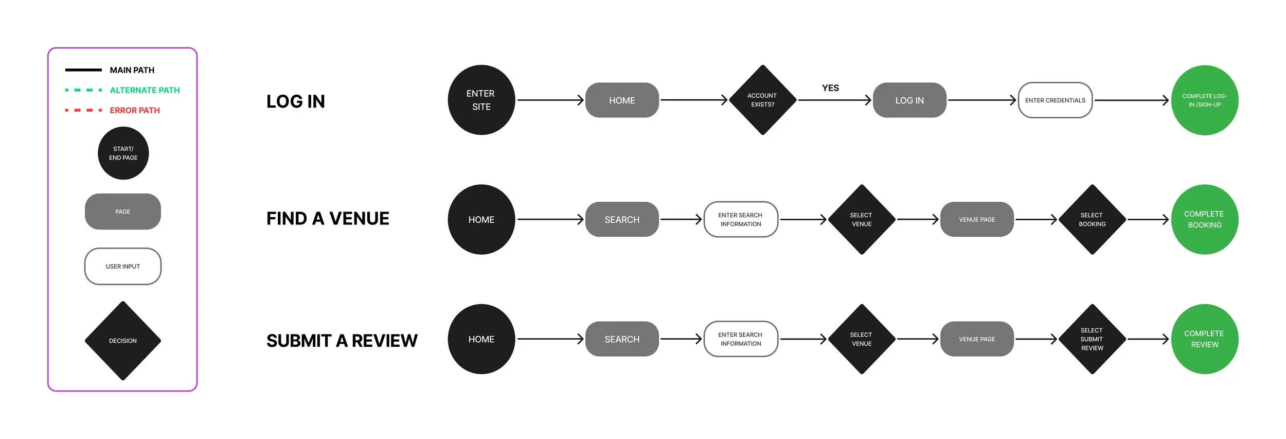
TASK FLOWS
Based on the pain points and needs I was provided, I narrowed down my focus to developing a platform that assists with locating venues. I picked three key screens to map out my task and user flows.
Task flows helped me to provide a general structure and outline of the journey of each key screen I want to create, from Point A to Point B.
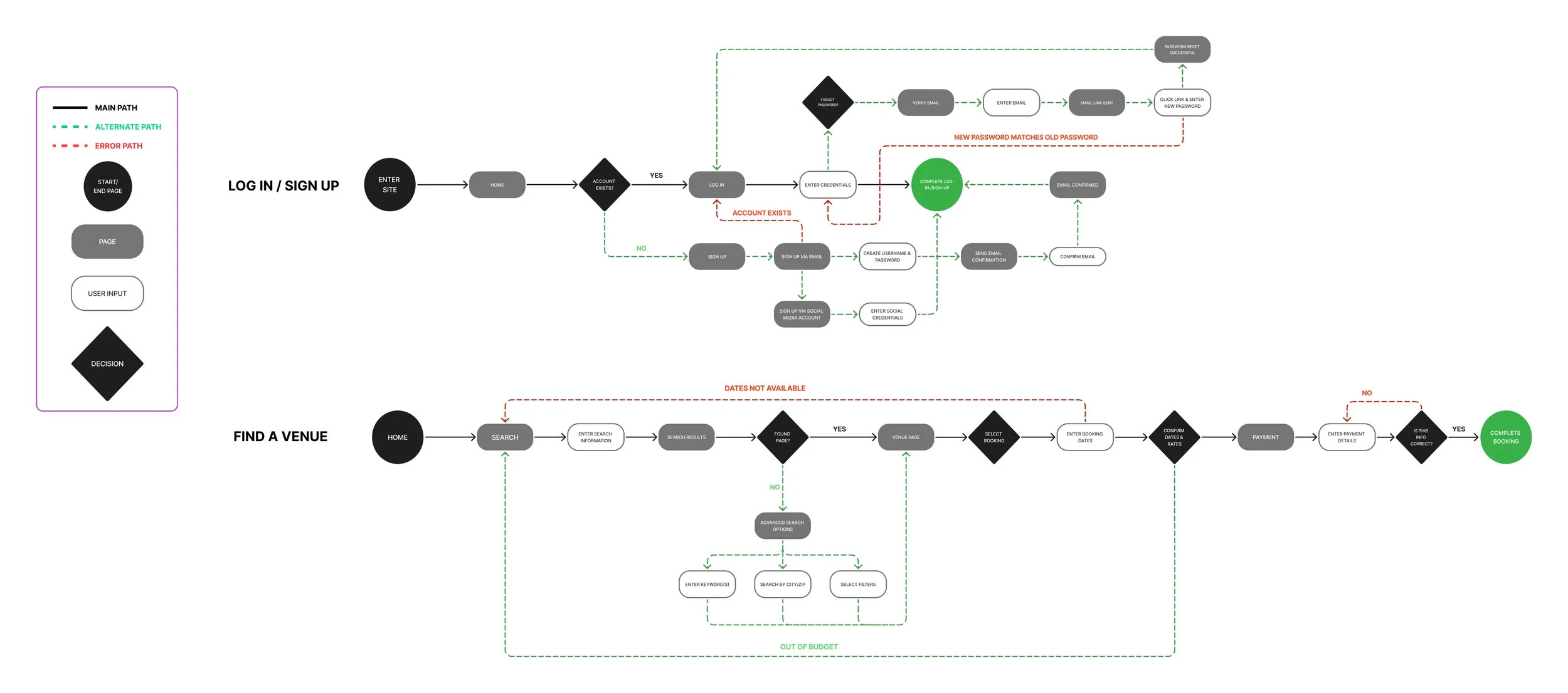
USER FLOWS
Like task flows, user flows helped me to visualize how the flow of a page would happen with a user, but also included areas where should the user deviate from the ideal site route, that they would be redirected, quickly and efficiently, to minimize frustration with navigation.
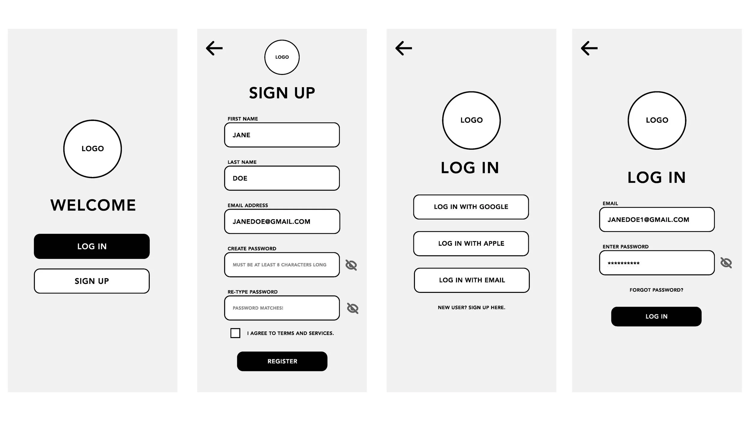
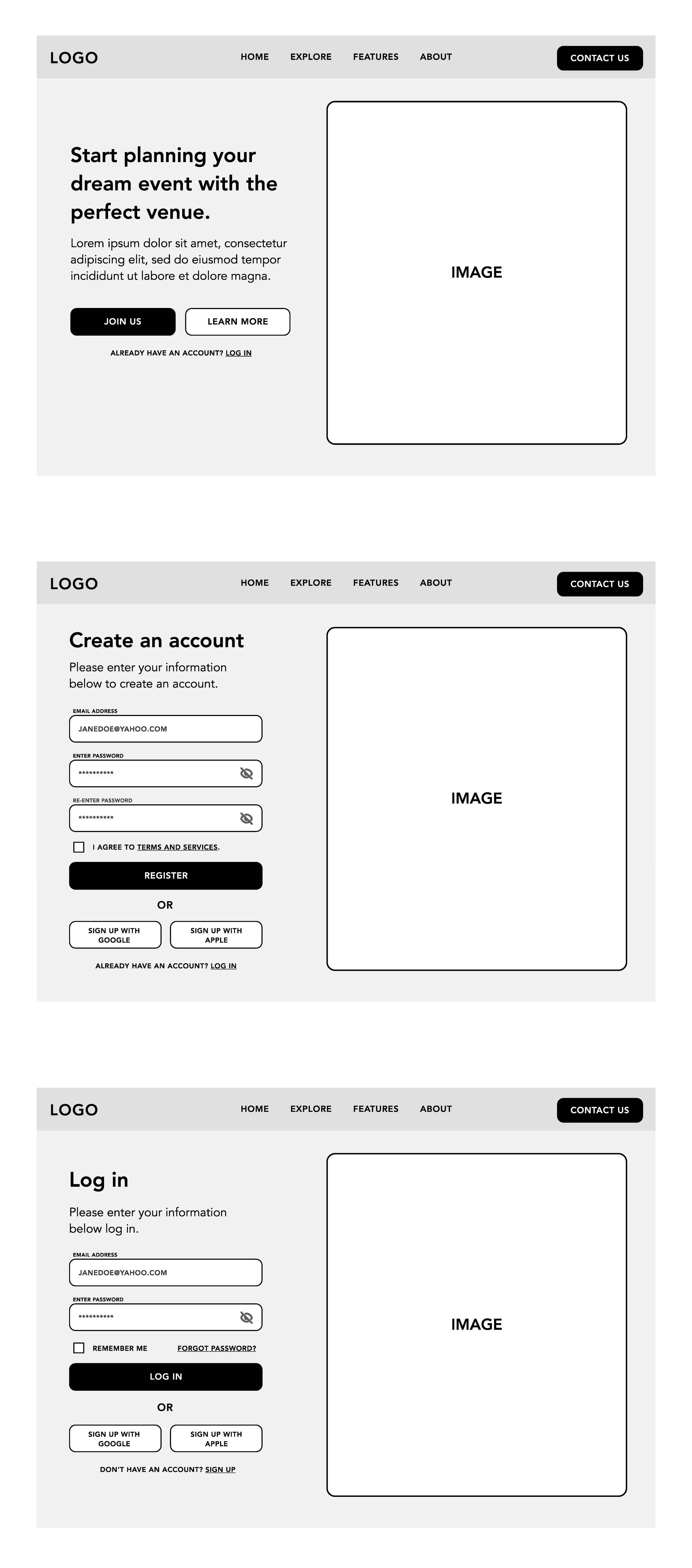
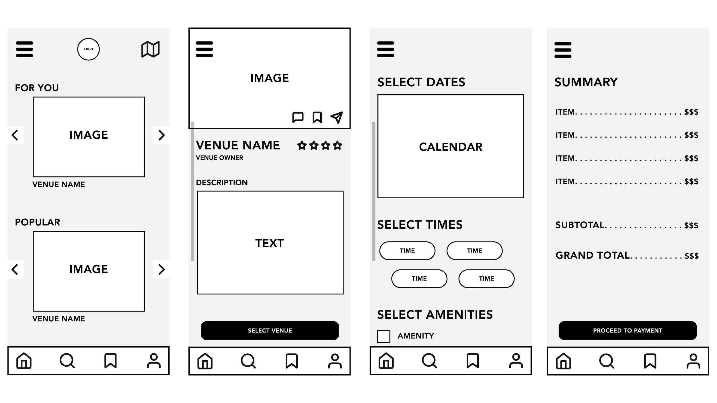
LOW & MID-FIDELITY WIREFRAMES
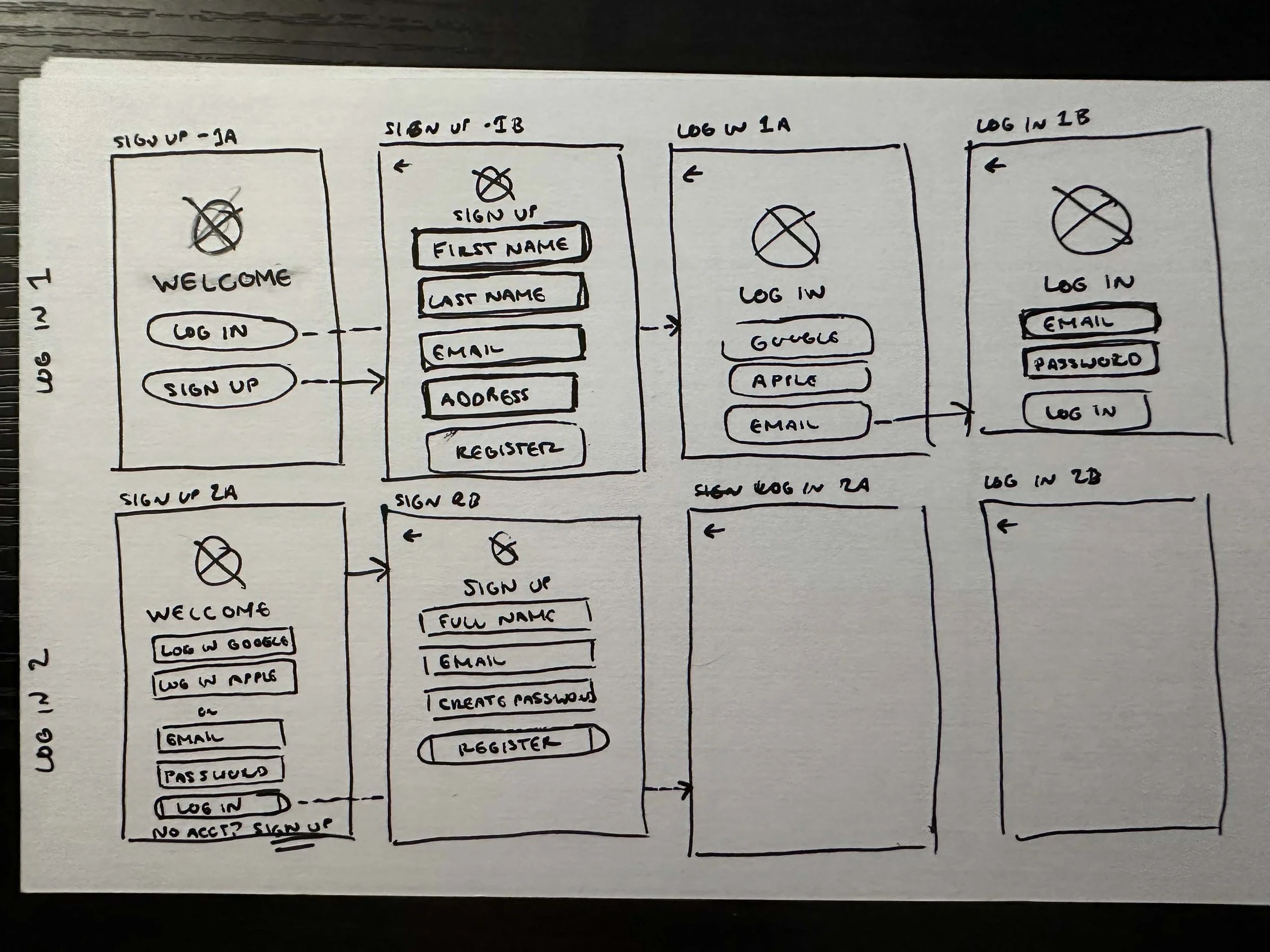
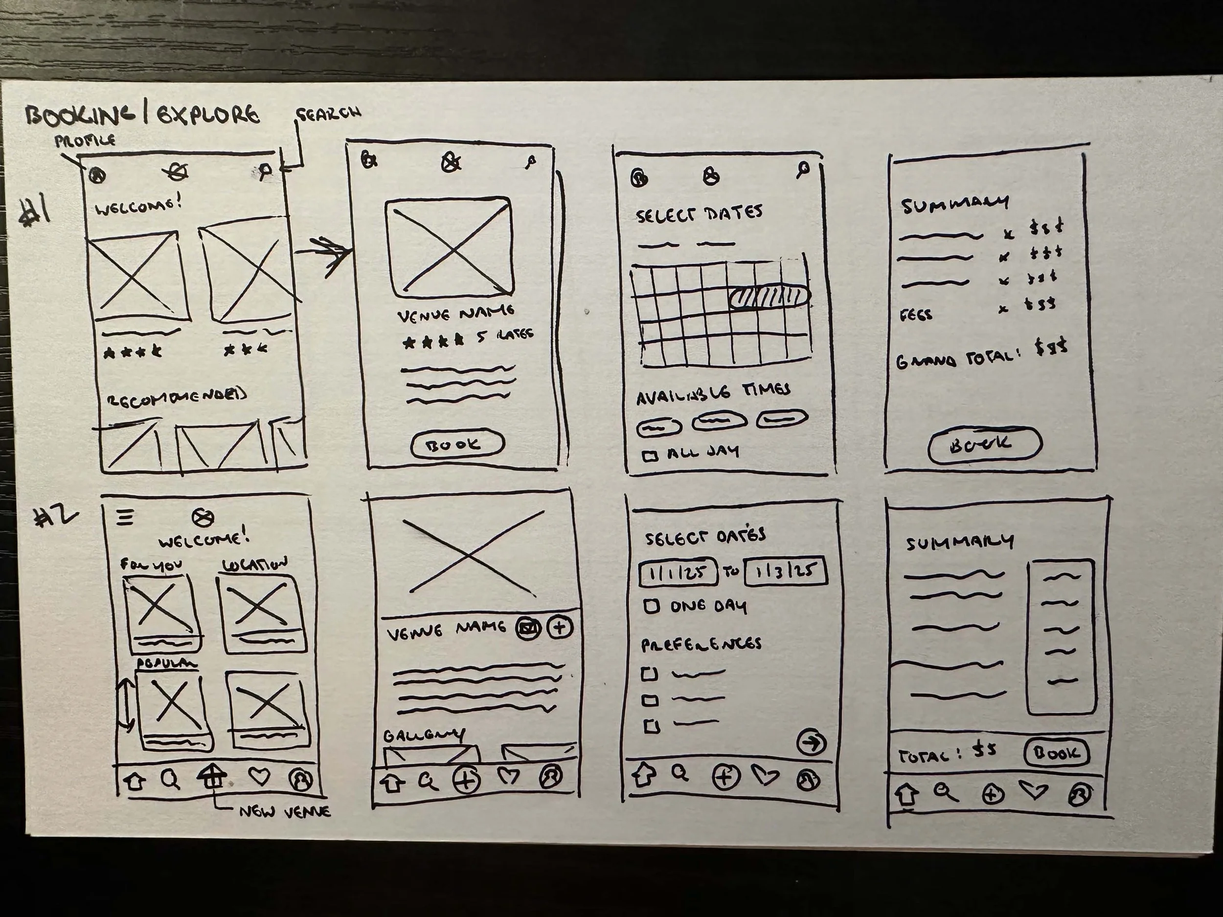
Created the foundational structure of key screens. This helped me to decide what important elements to consider in a key screen, and how to arrange each element. I started out with rough sketches to get an idea of how to orient each element, then refined each screen in Figma with low fidelity wireframes. Below are examples of key mid-fidelity screens for mobile, as well as their desktop/laptop sized counterparts.
STEP 5: BRANDING
This case study is in progress, please stay tuned for further updates!